flex box
이번 포스팅은 드림코딩 엘리님의 <CSS Flexbox 완전 정리. 포트폴리오 만드는 날까지! | 프론트엔드 개발자 입문편: HTML, CSS, Javascript> 유튜브 강의를 보고 정리한 것입니다. (사진 자료는 드림코딩 엘리님의 유투브에서 캡쳐해온 자료입니다.)
flexbox란?
item 과 box를 행 또는 열로 자유자재로 배치해주는 기술입니다.
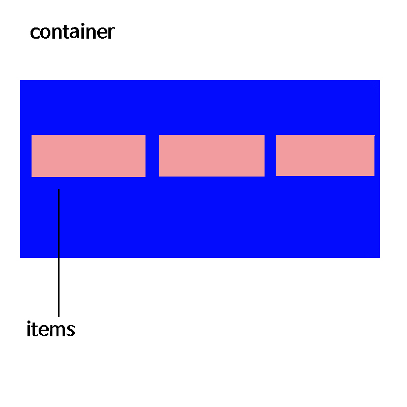
이 컨테이너 박스에 속성값들은
- display
- flex-direction
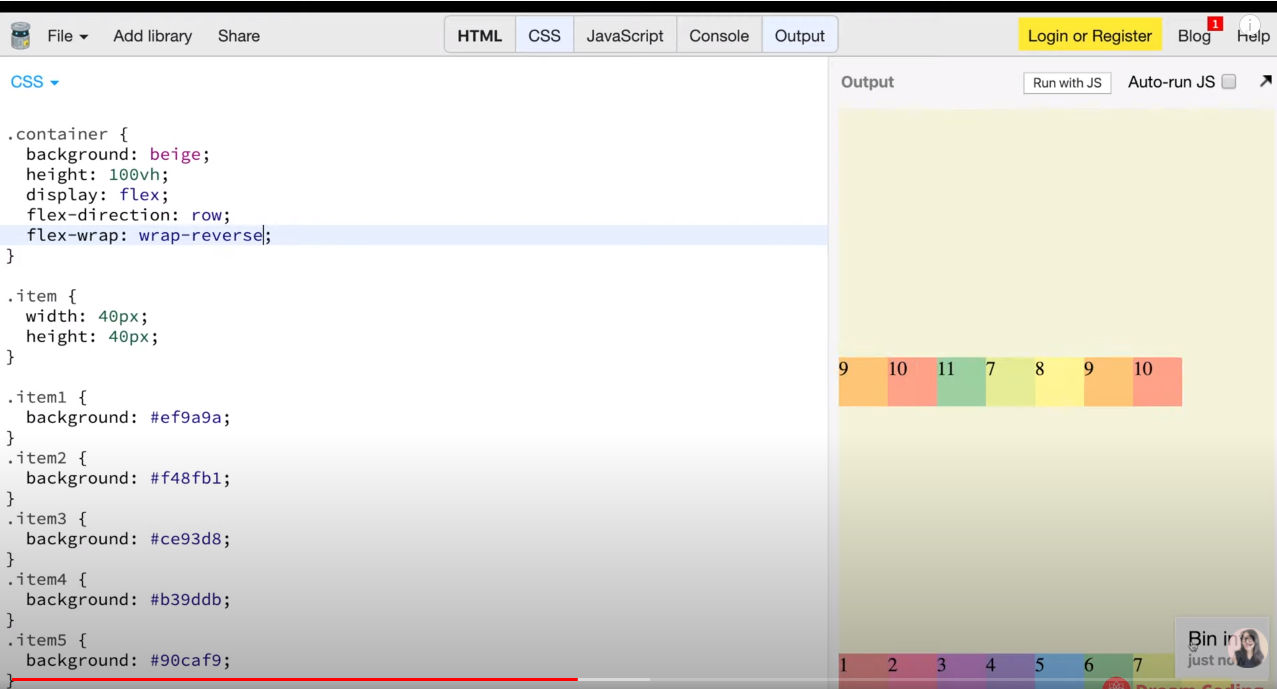
- flex-wrap
- flex-flow
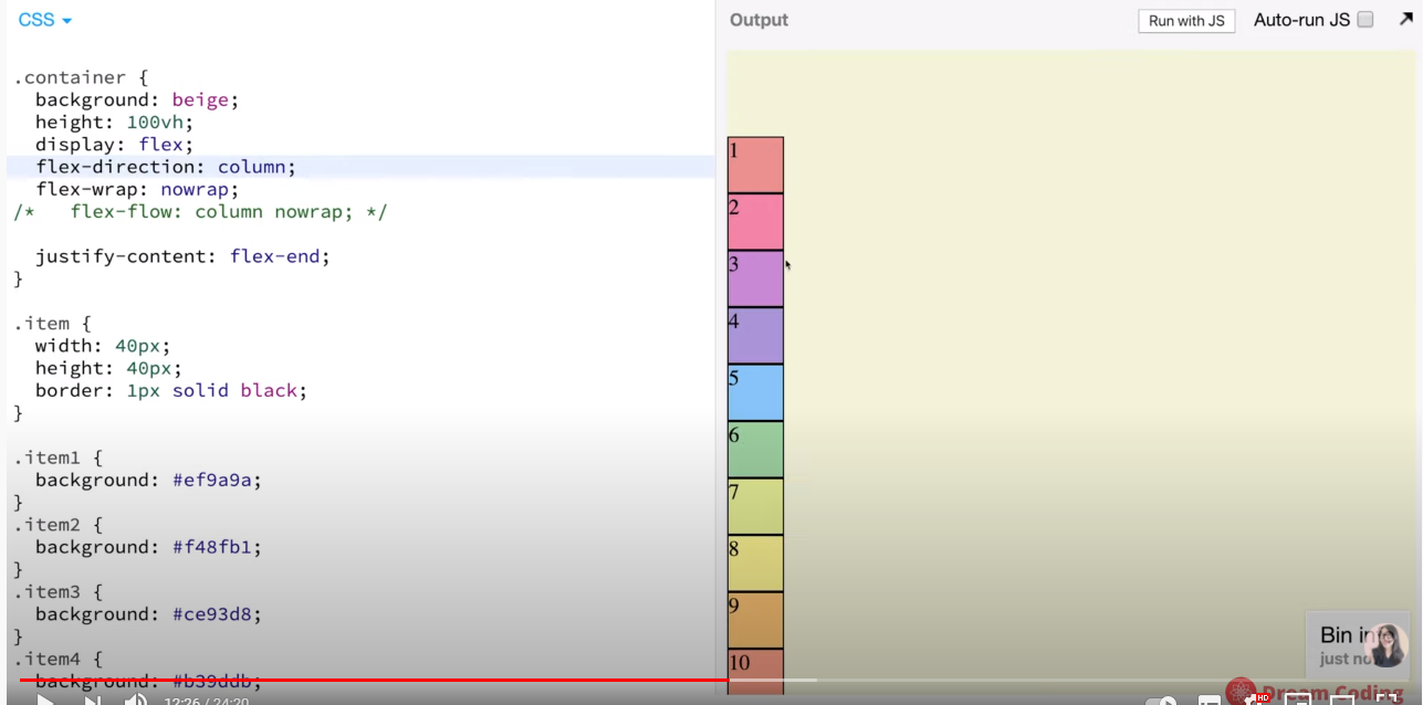
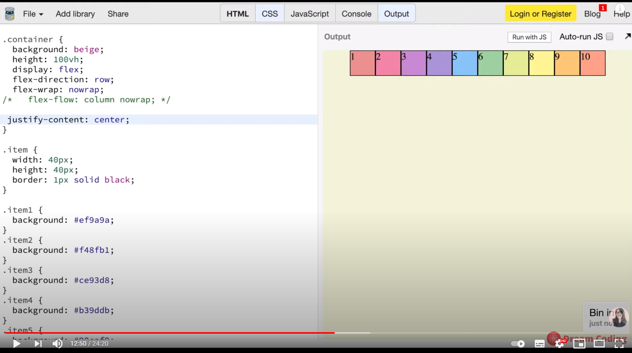
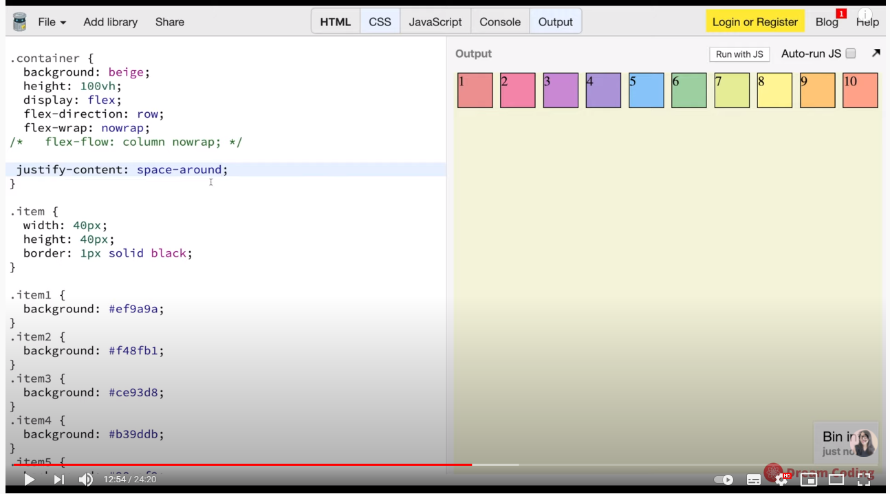
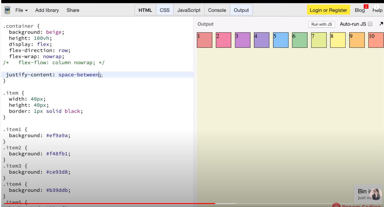
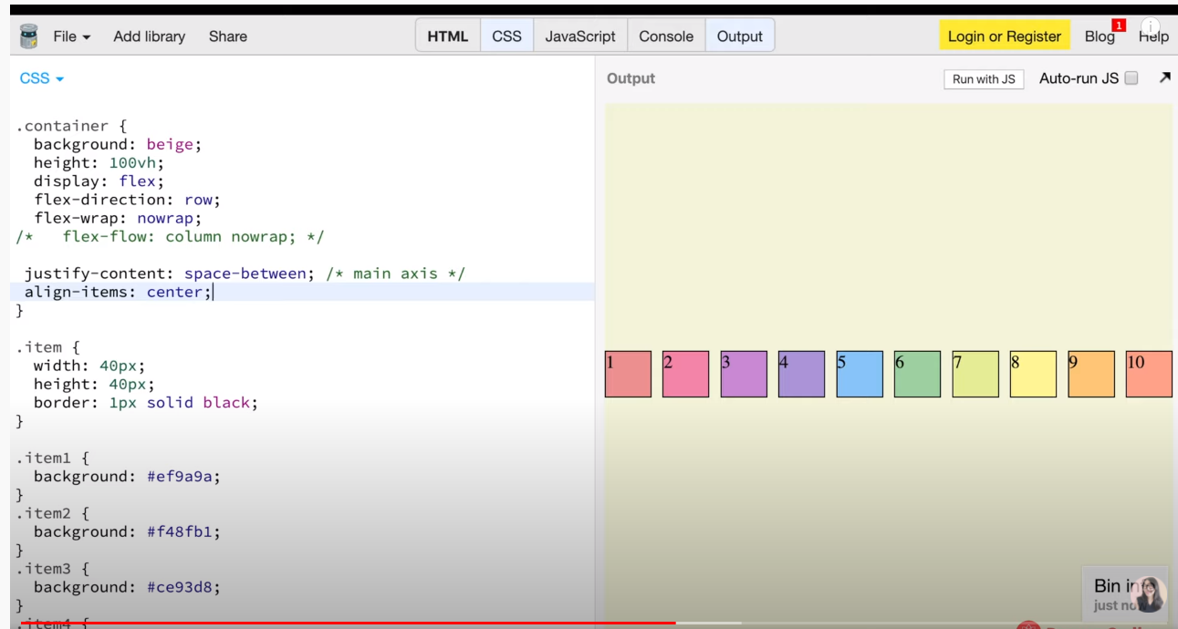
- justify-content
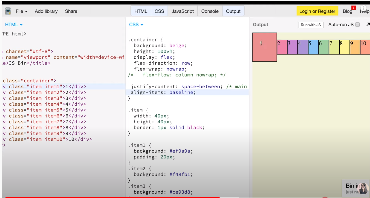
- align-items
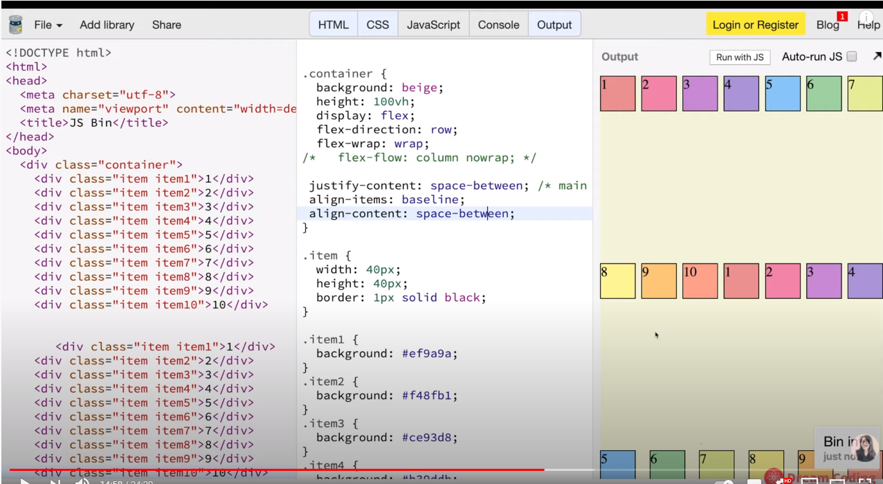
- align-content
출처 드림코딩 by 엘리
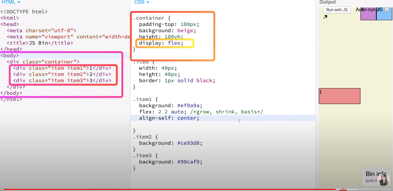
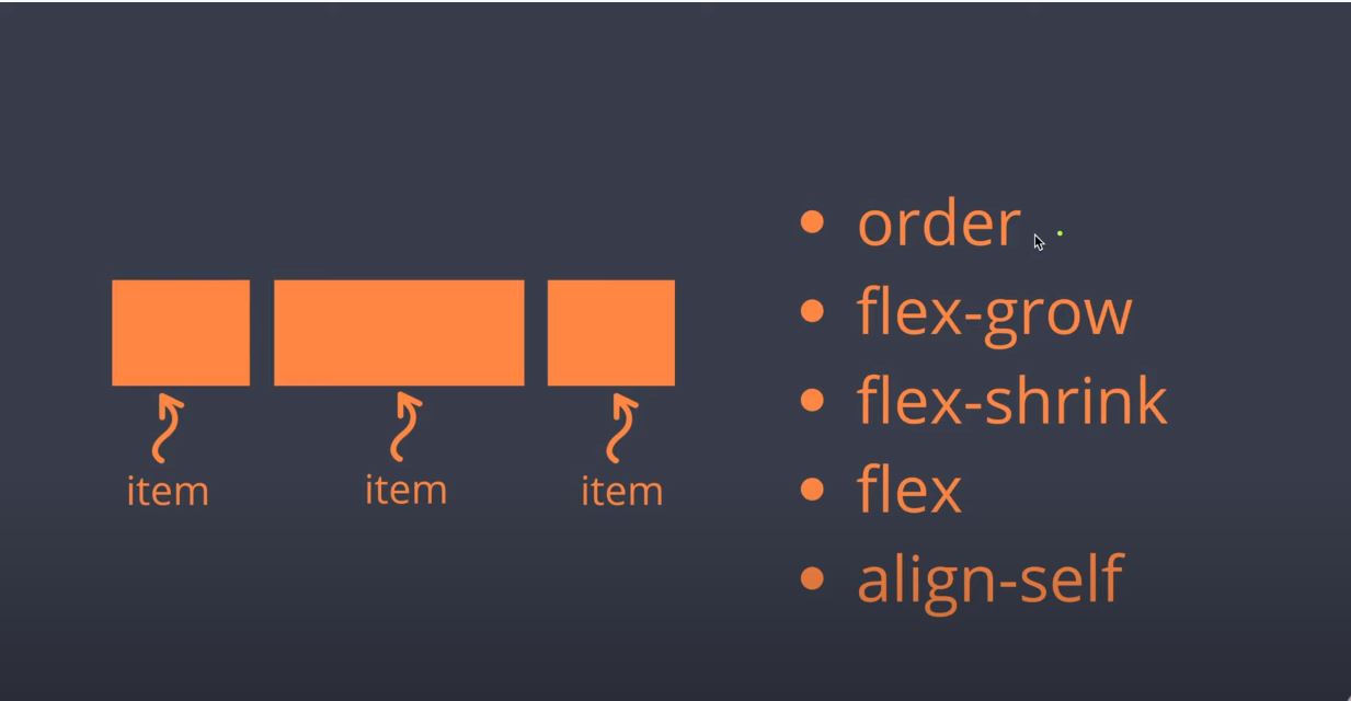
item 속성값은
- order
- flex-grow
- flex-shrink
- flex
- align-self
flex 박스에는 중심축과 반대축이 있습니다.
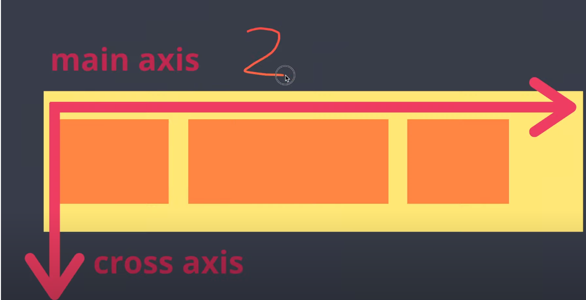
지금은 수평축이 중심이고 수직축이 반대축이당
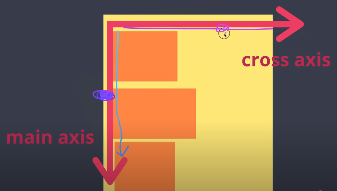
이번사진은 중심축이 수직축이고 반대축이 수평축입니다.
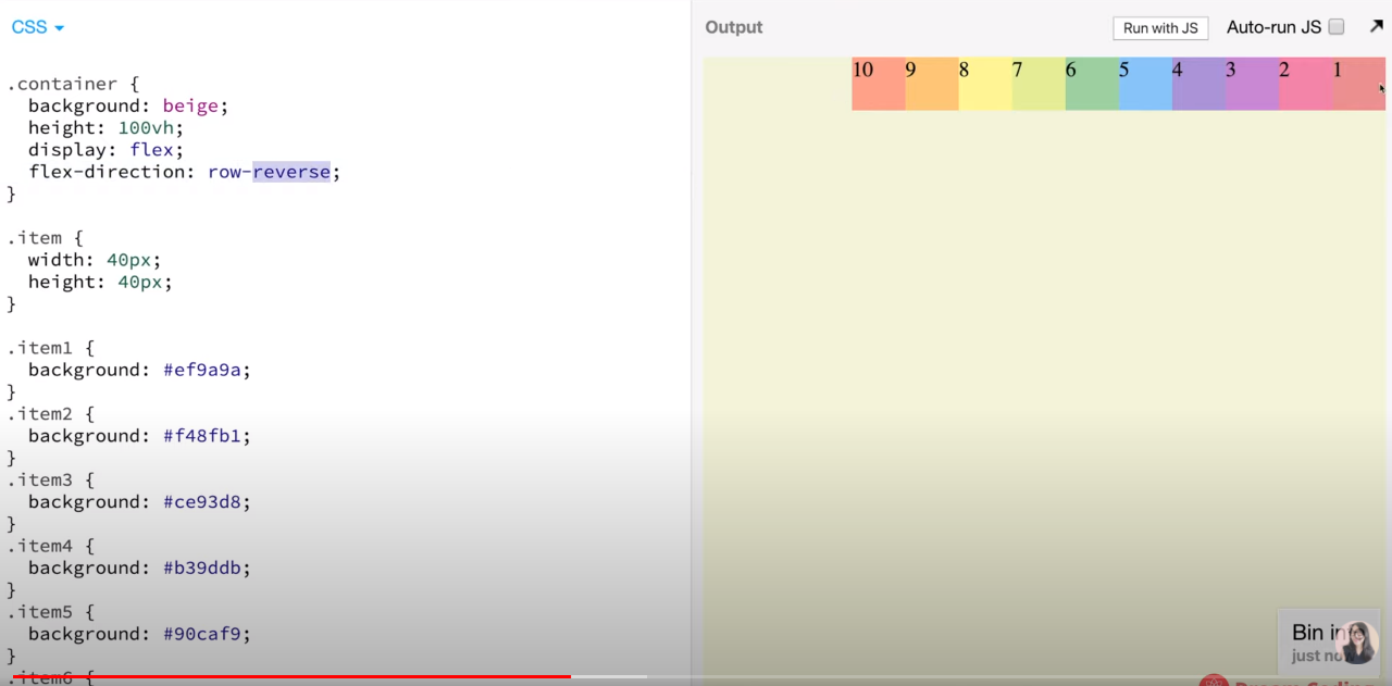
display:flex
flex-direction:row-reverse
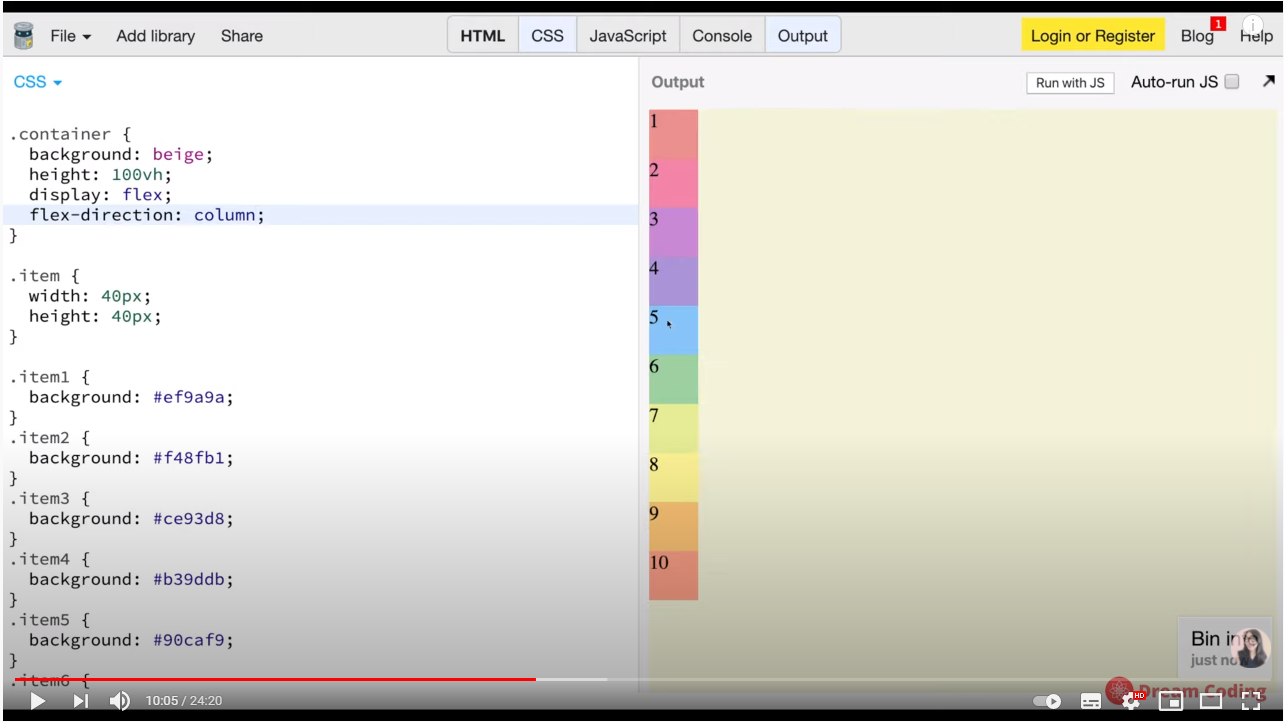
display:flex
flex-direction: column;
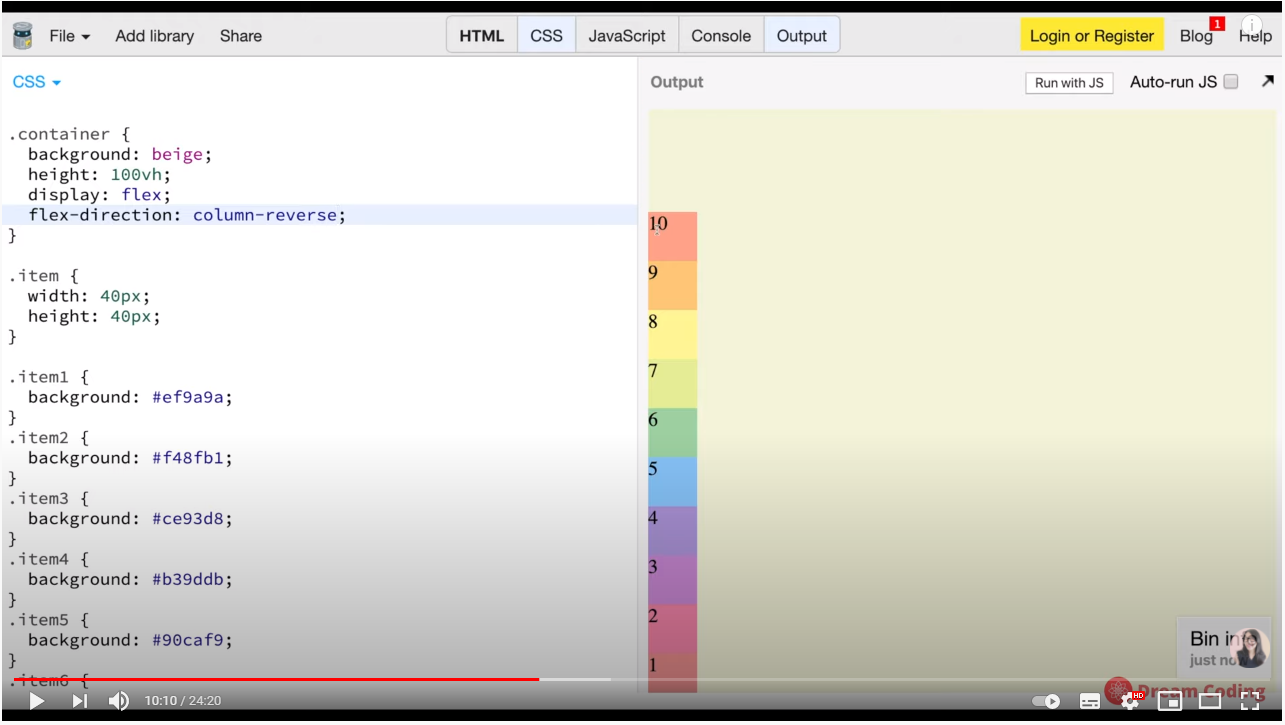
display:flex
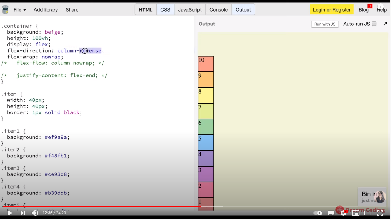
flex-direction: column - reverse;
display:flex;
flex-direction:row;
flex-wrap:wrap; 아이템들이 한줄에 꽉차게 되면 다음 라인으로 넘어가게 된다.
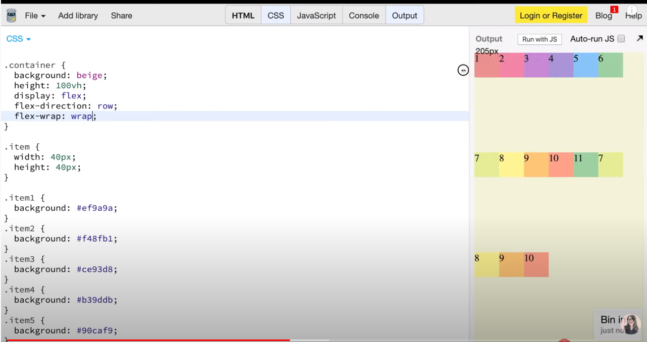
반대로 도 할수 있다.
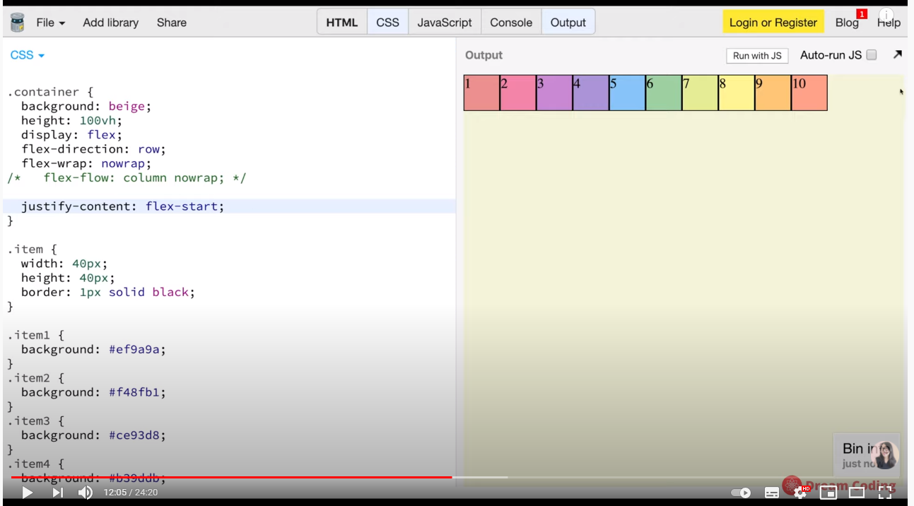
display:flex
flex -direction: row
flex-wrap: nowrap
justify-content:flex-start
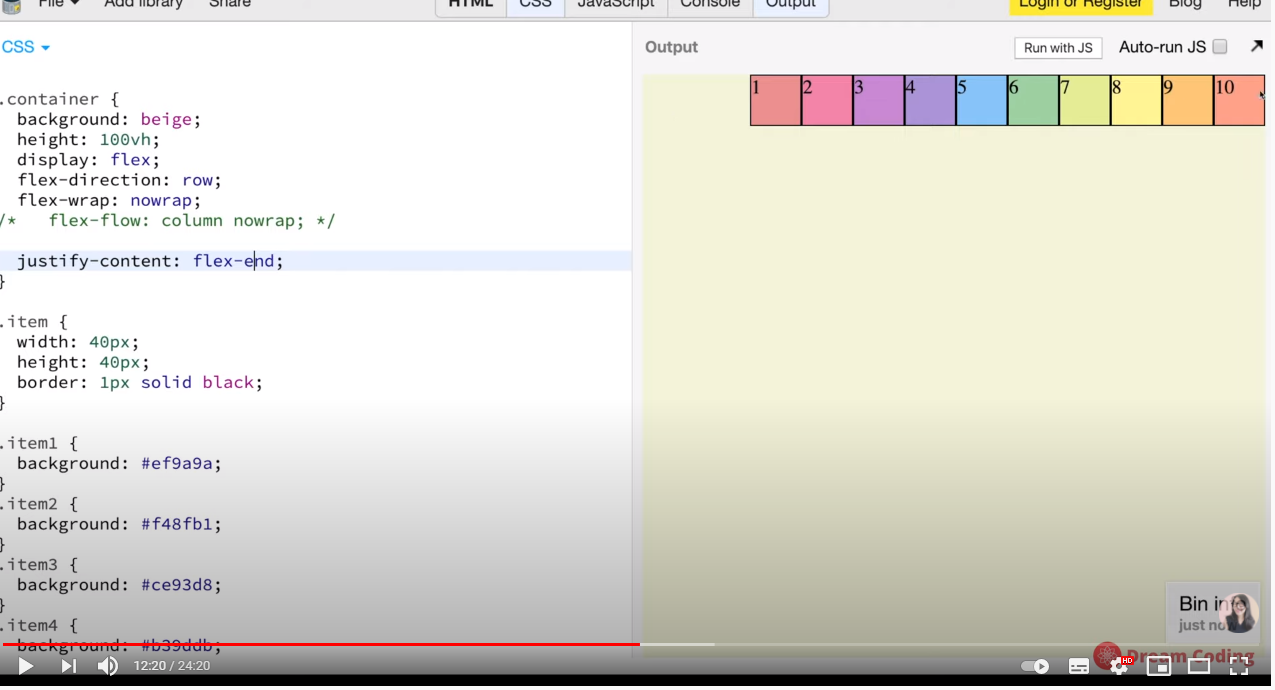
display:flex
flex -direction: row
flex-wrap: nowrap
justify-content:flex-end 순서는 유지하되 오른쪽 축으로 정렬
display:flex
flex -direction: column
flex-wrap: nowrap
justify-content:flex-end
display:flex
flex -direction: column-reverse
flex-wrap: nowrap
justify-content:flex-end
display:flex
flex -direction: column-reverse
flex-wrap: nowrap
justify-content:center
display:flex
flex -direction: column-reverse
flex-wrap: nowrap
justify-content:space-around
display:flex
flex -direction: column-reverse
flex-wrap: nowrap
justify-content:space-between
display:flex
flex -direction: column-reverse
flex-wrap: nowrap
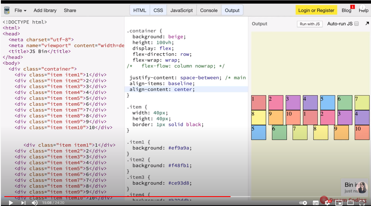
justify-content:space-between //main axis
align-items:center;
item 1 텍스트를 균등하게 위치해주는 게 baseline입니다.
display:flex
flex -direction: row
flex-wrap: wrap
justify-content:space-between //main axis
align-items:baseline
align-content:space-between
이제 item 속성값을 알아봅시다
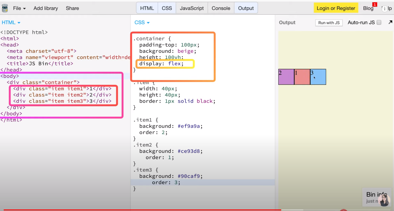
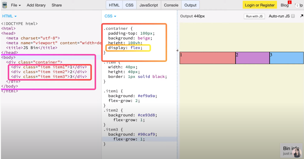
flex-grow:0 이 기본값입니다.
첫번쨰 item1에다가만 flex-glow:1을 지정했기 때문에 item1만 이렇게 늘려지고 있습니다.
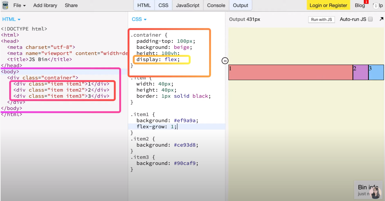
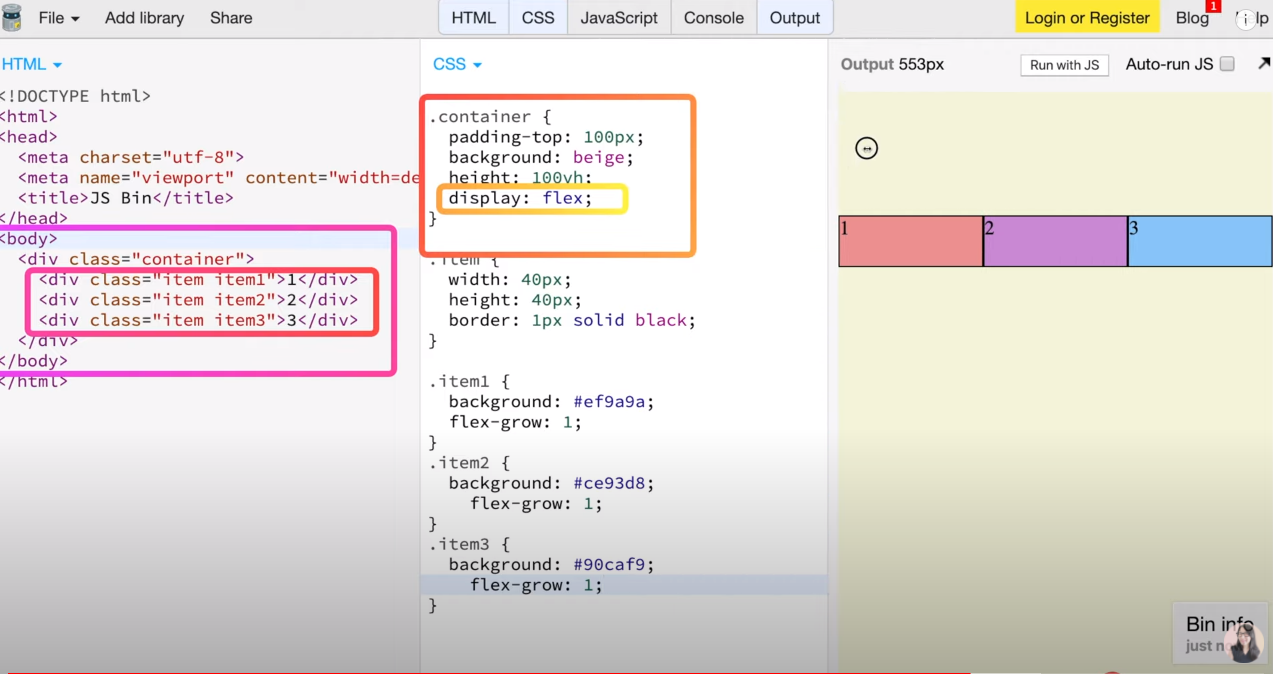
item1,item2,item3을 flex-grow:1을 지정해놓으면 균등하게 늘여집니다.
item1에게 flex-grow:2를 넣으면
item1만 2배로 늘여지게 됩니다.
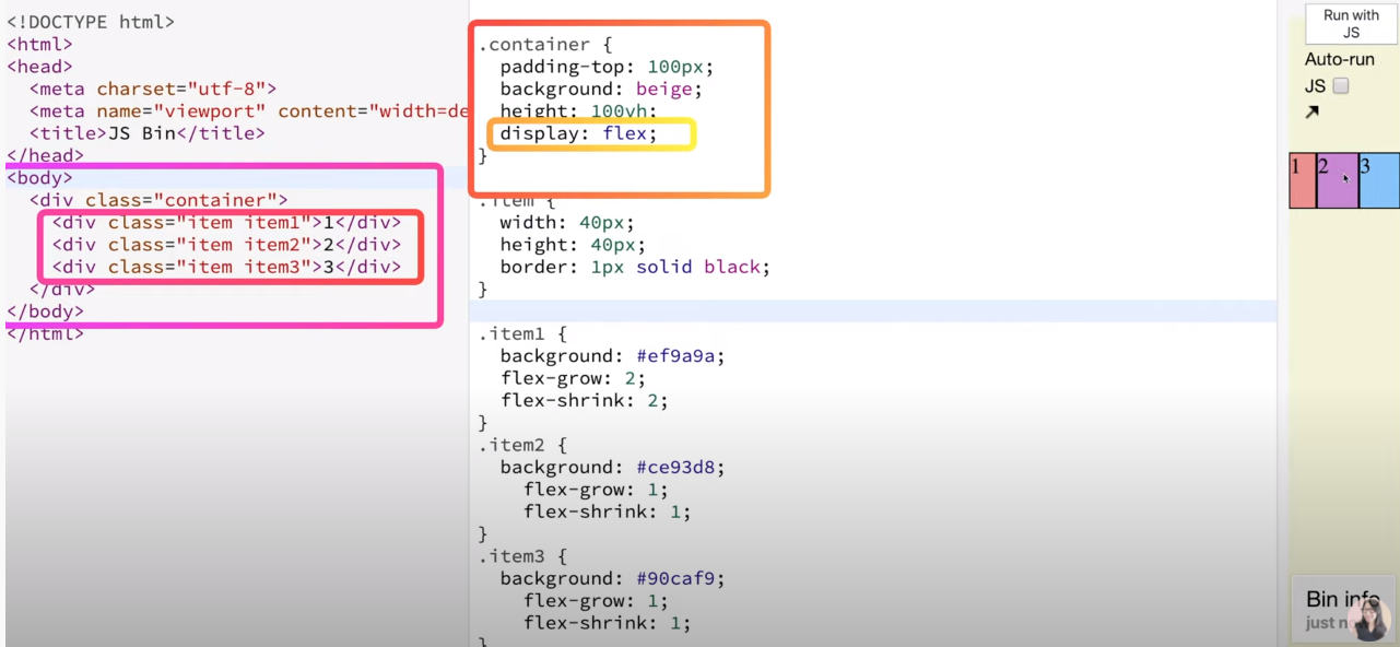
flex-shrink은 줄어들때 크기 조절할떄 사용합니다.
flex-shrink:1로 지정해 놓으면 줄어들떄 크기가 균등하게 줄어듭니다.
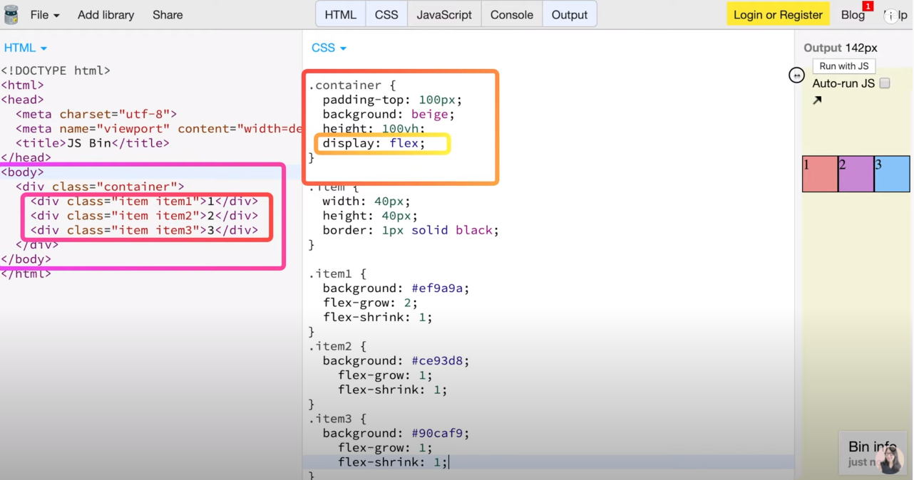
item1 너만 2배로 작게 줄어들어라!!
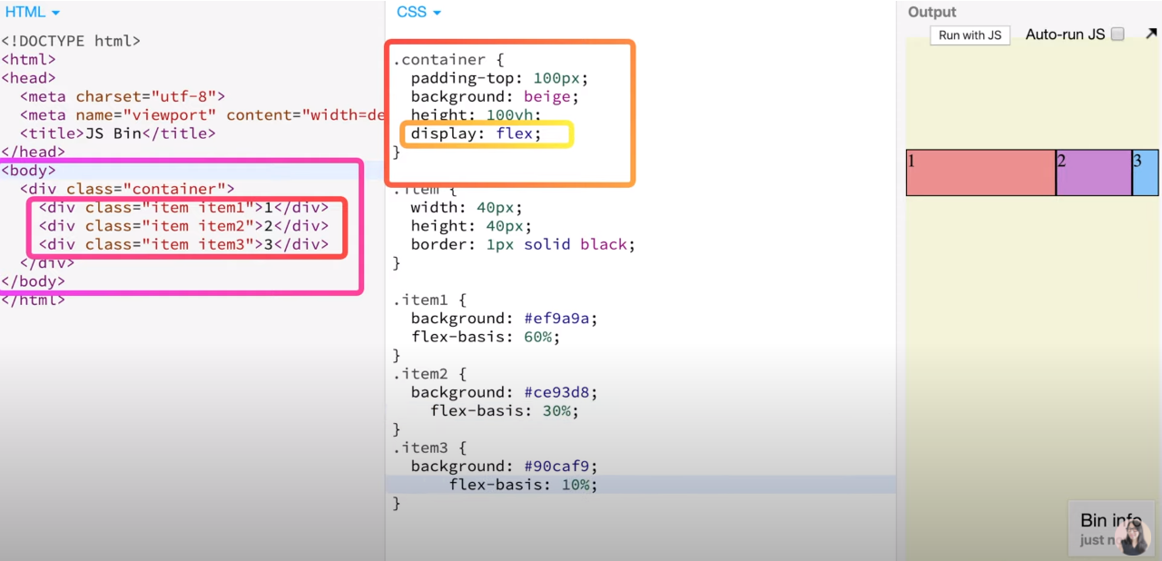
flex-basis를 사용하게 되면 flex-grow,flex-shrink를 설정하지않아도
flex-basis하나로 사용할수 있다.
크기가 커질때 작아질 때도 지정해놓은 퍼센트 비율로 커지고 작아집니다.
container에 벗어나서
한가지 item에다가 align-self:center로 설정해 놓으면
가운데로 정렬이 됩니다.